
King of the Beasts
Someone has rearranged my furniture. It took me years to get everything exactly how I liked it: I don’t even think I can move things back to the way they were. I am doomed to wander around, banging my shins into the coffee table until I learn the new layout. Is the new layout any better? I don’t care. My shins hurt.
That’s what your initial experience of Mac OS X Lion feels like, if you’re as anally retentive about how OS X performs as I. We’ve been through a lot: this summer marks my third anniversary of my migration from Windows. I say ‘migration’ but it felt more like fleeing from a warzone, watching as my friends were stranded in a horrible wasteland of terrible user interfaces and awesome video games.
I couldn’t go back to Windows as my day-to-day system, but that doesn’t mean I have the same level of excitement for OS X as when I first switched. I’m eagerly awaiting the release of iOS 5, but I don’t have any real issues with Snow Leopard. It’s a great operating system, just like Leopard was.
Lion is Apple’s attempt to bring the best of iOS to the Mac. Since iOS has arguably the best user interface of any operating system, mobile or otherwise, that’s no bad thing. However, iPhones are for poking and touching, while computers are for mousing and keyboarding. Is it possible to reconcile iOS and Mac OS X, and is that something we really want?
Up is the New Down
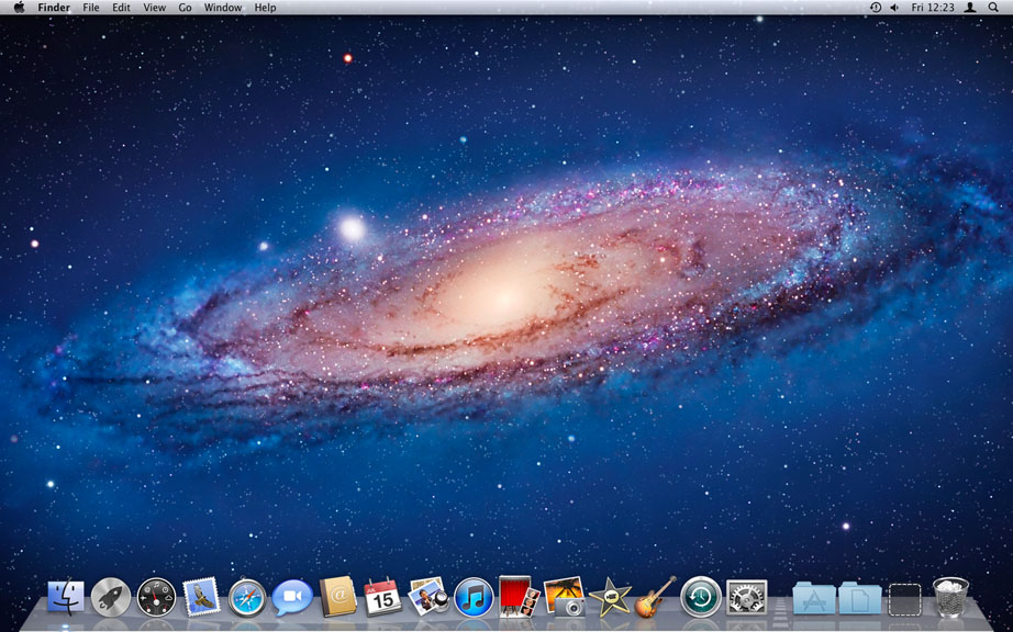
Although Lion looks similar to Snow Leopard, you’ll soon realise you can’t scroll up and down any more. In Lion, scrolling is reversed to mimic scrolling in iOS. Push up with two fingers to scroll down and vice versa. It feels revoltingly alien at first, then it becomes natural: I’m not sure which way is better, but the reversed scrolling puts Lion at odds with every other operating system including previous versions of OS X. As someone who uses Snow Leopard every day on all sorts of machines, this is a tad confusing! ‘Pushing the content’ is a better metaphor when using a trackpad than scrolling a viewing window over your document, which is essentially what the traditional scroll bar does. With a mouse, it makes less sense, and Lion can’t remember separate scroll settings for a mouse and a trackpad. Someone will release a third-party utility for this, but they shouldn’t need to.
Scroll bars have disappeared and only come into view when you’re scrolling (assuming you’re using an app that’s been optimised for Lion). To be honest, we’re better off without the cruft. Scroll bars were useful in the days before the wheel mouse, but when was the last time you actually clicked and dragged on one? When you reach the end of a scrolling area, there’s a nice elasticated bounce with which iPhone and iPad users will be familiar. Mouse owners should note that Lion works best with a trackpad, be that on a laptop or a ‘Magic’ Bluetooth option. This is great for two reasons: Apple’s trackpads have always been the best in the industry and their mice have always been the worst. If you have an older MacBook with a physical click button separate from the tracking area, performing new gestures in Lion feels cramped.
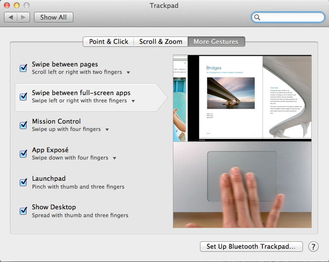
Snow Leopard already supported multi-touch gestures, but Lion takes it much further. It pervades every corner of the user interface: a pinching motion gives quick access to all your apps, while an outward flinging gesture shows the desktop. Using three fingers, you can skim between various desktops and full-screen apps. It takes some getting used to, especially when I’ve spent the past two years swiping down for Exposé and now have to swipe up. It’s like playing a game with no option to invert the camera controls: you just have to adapt.
If there’s one thing power users hate, it’s adaptation. I want my computer to work the way I tell it to- through augmentation, if necessary- and not the other way around. Lion is inflexible in this regard and hopefully some developers will step in to aid those who demand greater customisation. Some of the gestures I loved from Snow Leopard- three finger swiping to go back and forward in Firefox and Finder, for example- require tinkering to restore their functionality under Lion (thanks Ronan!). Unfortunately this doesn’t play nicely with the reversed scrolling and so iCal feels like it’s moving backwards when you swipe.
Not to worry, though. The average Mac user is going to have a great time, while I’m gesticulating wildly like an irate driver in a traffic jam.
Full Screens Ahead
The most misunderstood part of the Mac user interface isn’t the Dock: it’s the zoom button. That little green circle has been a difficult topic for my Mac classes, because people struggle to grasp the underlying concept. I blame the teacher.
Let me illustrate why it is not broken. Indulge me. The Zoom button in Mac OS X is trying to resize the window so it takes up as much space as it needs. If I take a cramped window and click the Zoom button:
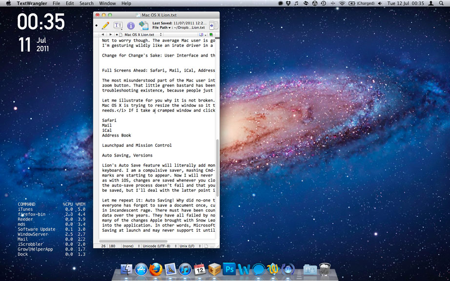
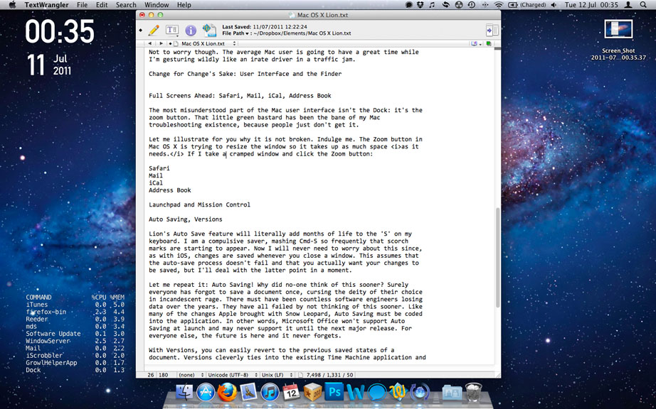
It fills to take up the space it needs, not the entire screen. Mac users often have windows behind windows, because we can scroll the content of one window without having to click and bring it into focus. I can read through a website while still being able to type in a document: I don’t do it very often, because it’s extremely confusing, but I can do it nevertheless. To illustrate this distinction further in a web browser:
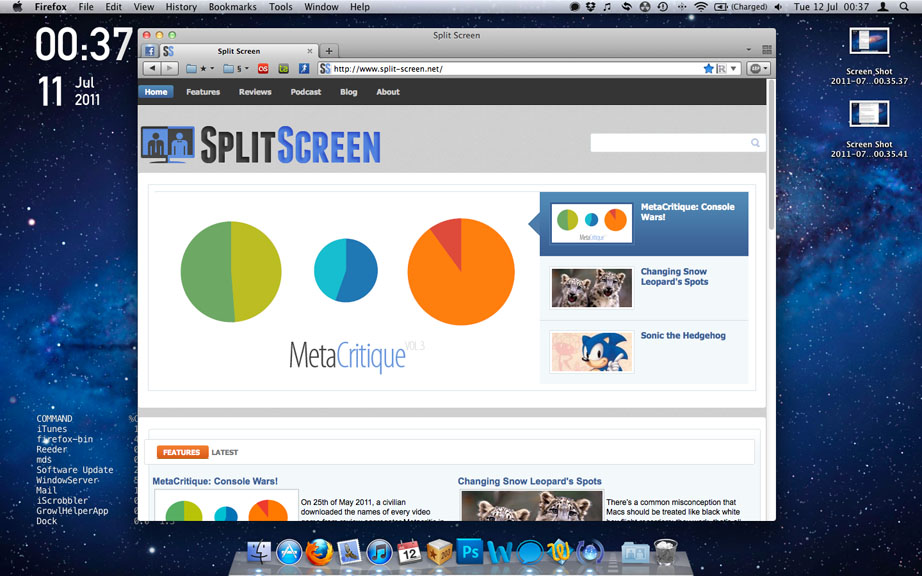
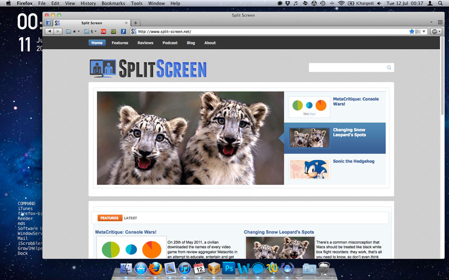
You have achieved nothing by dragging the size of this window out; you’ve merely increased the border size. Windows users run maximised apps all the time, but they’re not maximising their screen estate: there are still bezels, menu bars and borders in the way. This is where full-screen apps in Lion come into play. As with most Apple software features these days, the idea isn’t original, but the implimentation is streets ahead of its competitors. Core apps like Safari, Mail, iCal, and Preview now have a full-screen button where the old ‘hide toolbar’ button used to be (or as I called it, the Grey Button of Perpetual Mystery). These apps don’t just fill up the screen: they engulf an entire desktop.
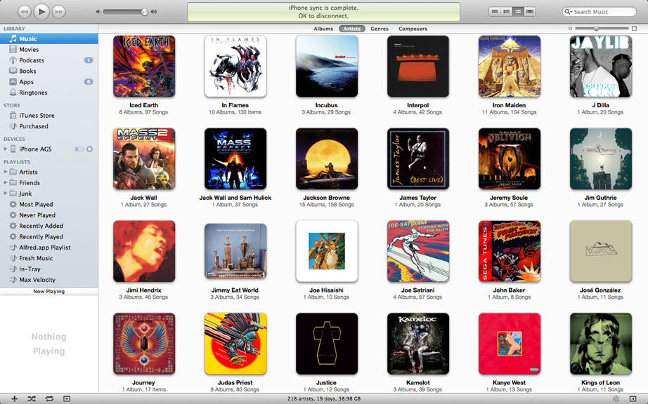
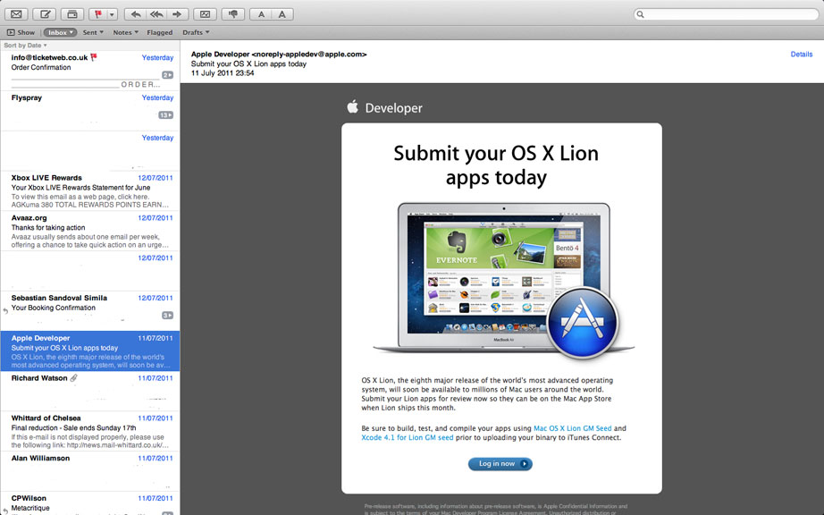
Previously, window management was a precarious juggle of content, but this is so much better. A full-screen iTunes browser is a sublime way to browse your collection, while Mail focuses on your emails rather than the boxes in which they reside. iCal stands out as looking a bit barren, but maybe that says more about my social life than the app. The real power of Lion is that this functionality is baked into the OS, letting developers easily take advantage of it. There’s a world of difference between a screen-filling Photoshop and a desktop-gobbling Photoshop. We’re already seeing third-party apps taking advantage of this.
It’s not all rosy in the Lion user interface garden. The unnecessary smaller traffic light buttons feel smaller to hit, even if we’re talking about a difference of a few measly pixels. There’s an extremely irritating animation that pops new windows into place out of the void, which is not a useful visual metaphor for what’s actually happening. The monochromatic icons are not as easy to discern as Snow Leopard’s more colourful equivalents. The blue lights under running apps are hidden by default, which is perhaps a sign of things to come as increasing numbers of Mac apps support state saving and automatic termination when unused.
iCal sports an ugly new skin that mimics a paper calendar, but does nothing to improve usability since it operates the same as the Snow Leopard version. As John Siracusa’s wonderful review of Lion for Ars Technica points out, we can’t actually peel up a calendar page like when reading in iBooks. Likewise, Address Book has had a lick of paint and Photo Booth now looks more like a real photo booth, but these serve to distract rather than to enhance functionality. This aesthetic emulation of (outdated) real world products runs contrary to the minimalism of Apple’s hardware design and the other UI changes in Lion.
It’s possible to reverse some of Lion’s egregious user interface changes, but for the most part you’ll have to get used to it. As with the iPad and iPhone, Apple are further trimming the user interface to focus on your content. What’s not clear is whether this is the right approach for the Finder and other apps that need to display detailed information. Rather than bringing the best of iOS ‘Back to the Mac’, it feels like Lion only takes it halfway and doesn’t quite get it right.
So Near and Yet So-fari
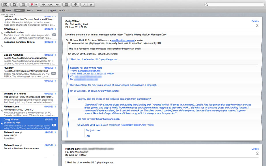
At this stage in the web browsing game, wild horses couldn’t drag me back to Safari. In the interest of fairness, I tried to get back into it for this review. It’s still not good enough: sure, it’s very fast, the new font rendering is gorgeous and I appreciate it’s minimalist interface, but it always feels broken out of the box to me. Here’s an example: type ‘split screen’ into the address bar in Firefox, Chrome and Safari. Firefox and Chrome will search Google, while Safari merrily reports that it’s not a website, but if you click a button at the bottom of the page it’ll search Google. Why? Just… why?
I tried to add some ‘extensions’ to Safari to emulate my Firefox configuration, but it’s not possible. You can’t get rid of the search bar, pin tabs as apps or even have favicons (identical looking text bookmarks are not a substitute), with or without extensions. Despite Safari’s appreciable improvements, it’s just not as good as Firefox or Chrome, but it’ll do in a pinch on someone else’s machine.
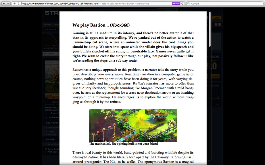
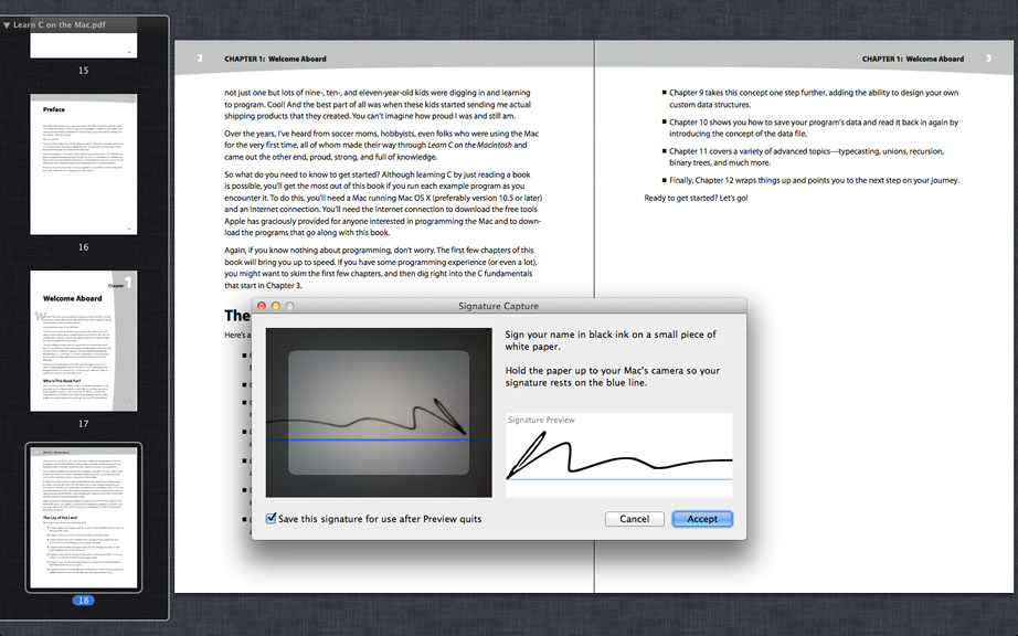
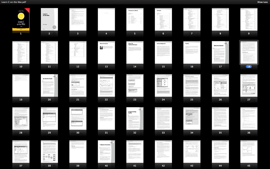
Moving on to brighter things, Preview reaches new mind-melting levels of brilliance in Lion. The world’s best PDF reader now lets you flick through documents at blazing speeds, effortlessly see an overview of the whole document at the touch of a button or digitally sign a document using your webcam. It’s absolutely lovely. If your job involves reading journal articles or other PDFs, go buy a Mac right now. You don’t know what you’re missing. If I ever catch you installing Adobe Reader on the Mac, I’m confiscating your computer. It didn’t love you anyway.
Action Stations
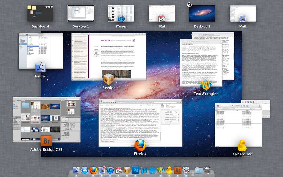
Exposé was a decent solution to a complicated situation. Window management has always been a pain in the ass, but Exposé did a nice job of spreading out your windows whenever you needed to pick out an individual document. Mission Control gives Exposé a bit a of a turbo boost: windows are better differentiated, with lovely icons to show their associated applications. Unfortunately you can no longer sort your windows by clicking on the Dock Icon, but it’s still only a Ctrl-F3 away.
Drag a window to the top-right corner of Mission Control and it becomes a new desktop space. I’ve always found Spaces convoluted and stifling to use, but this new ease of space creation and management is a lot more flexible than the bad old days. Dashboard has been moved (or should that be relegated?) to its own space, which is available by swiping left of your main desktop.
Mission Control isn’t that impressive by itself, but in combination with full-screen apps it goes to war on cluttered desktops and emerges victorious. The smaller your Mac’s screen and the more easily confused you are by cascading white boxes, the more useful you’ll find it.
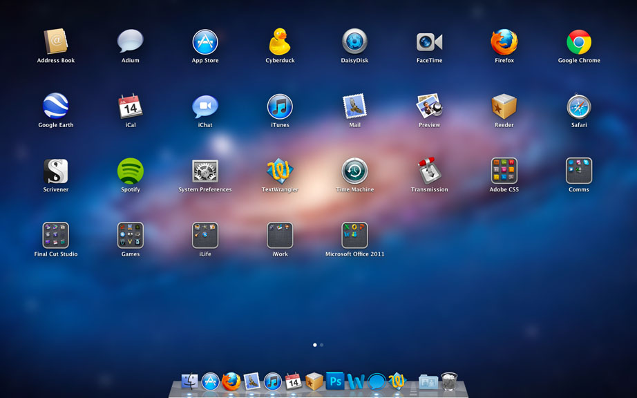
If you didn’t take my advice and install Alfred for all your application launching needs, Launchpad provides quick access to them. Launchpad replaces the stack of aliases I hacked together in Leopard, subsequently replaced by a real stack in Snow Leopard. I’ve long since removed this stack from my Dock and rarely use Launchpad, but I can certainly see the utility. It’s great for novice users who don’t want to get their hands dirty with Spotlight or understand the Applications folder.
Launchpad makes a mess of your apps when you first use it. They are all over the place: Adobe Creative Suite is a particular offender with its multiple folders providing multiple irritations. You can’t remove app links from Launchpad because it’s a direct representation of /Applications, so I ended up with several ‘Junk’ folders and no obvious way to remove them without deleting the files from /Applications, which obviously wasn’t an option. It took me a good ten minutes to sort out my wanted apps from the garbage: it’s not as elegant as I was expecting.
Taking Time Machine into the Future
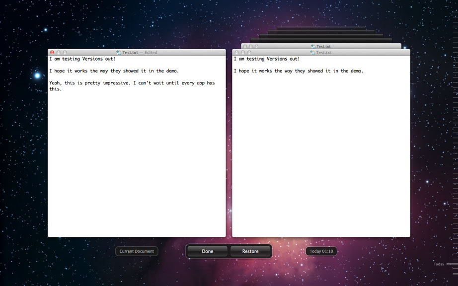
Lion’s Auto Save feature will add months of life to the ‘S’ key on my keyboard. I am a compulsive saver, mashing Cmd-S so frequently that scorch marks are starting to appear. Now I’ll never need to worry about this since, as with iOS, changes are saved whenever you close a window. This assumes that the auto-save process doesn’t fail and that you actually want your changes to be saved, but I’ll deal with this latter point in a moment.
Let me repeat it: system-wide Auto Saving! Why did no-one think of this sooner? Surely everyone has forgot to save a document once, cursing the deity of their choice in incandescent rage. Like many of the changes Apple brought with Snow Leopard, Auto Saving must be coded into the application. In other words, Microsoft Office won’t support Auto Saving at launch and may never support it until the next major release. For everyone else, the future is here and it never forgets.
With Versions, you can easily revert to the previous auto-saved state of a document. Versions cleverly ties into the existing Time Machine application and so doesn’t require any additional setup. This isn’t a terribly new feature: I’m currently writing this document to my Dropbox, which also saves versions. While it’s true that Windows has an analogue of this feature, it’s also true that you didn’t know about it or use it. Apple excel at applying unoriginal concepts in easy-to-understand ways: features are useless if we don’t take advantage of them. That’s what makes applications like Time Machine so great and Microsoft’s User Account Control Harassment in Windows so terrible and dangerous.
Lion also loses some classic operating system bugbears: its Resume feature remembers all of your open windows between sessions, even if you need to restart to apply a software update. I previously had a neat little hack in place to launch Mail, iCal and iTunes automatically when I started my computer, but this is a much more elegant and stable solution.
Slouching Towards Dystopia: The Mac App Store
Steve Jobs is Big Brother! Boot stamping on a human face! 1984! BOOOO! Right, now all that bullshit is out of the way, we can have a serious discussion about the Mac App Store.
No-one makes you buy Apple products, okay? They are not a totalitarian government, despite what your Android owning friends might say. There was always a choice to buy the iPhone or not buy the iPhone, and with that purchase comes the knowledge that you’re buying into a closed system. The iPhone works incredibly well at a limited subset of tasks, and stability comes at the cost of customisation. Whether you think that sacrifice is worthwhile is another matter: personally, I never want to type UNIX commands into my phone, but to each their own.
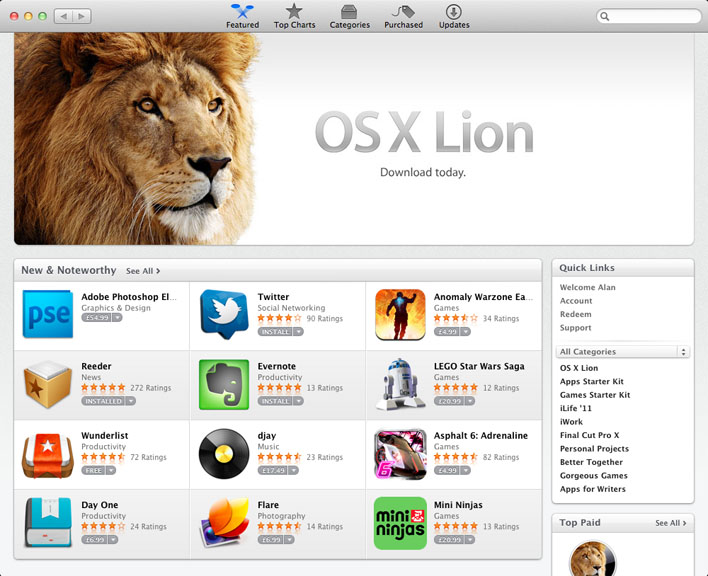
First things first: the App Store is the only way to get Lion, at least until August when Apple release an overpriced USB drive alternative. You must have Snow Leopard to upgrade to Lion, and the only way to purchase Snow Leopard is now through the Apple online store. Bad news for consumers with slow connections or without Snow Leopard, bad news for retail partners and resellers. While the App Store as a medium of distribution is fine, it’s the removal of the physical media option that is so unnecessary and frustrating. What happens if you forget your administrator password on Lion? What are you going to use to reset it without a disc and no Password Reset Utility in Lion’s recovery partition?
The App Store and its ‘walled garden’ invariably come to the forefront of any iOS discussion. While I think the App Store is great, it’s also unfair of Apple to shift the goalposts in the middle of the game by changing the rules for developers. Locking out unauthorised jailbreaks is one thing, but messing with people’s livelihoods is another. With Lion, the App Store comes to the Mac and there are similar mixed feelings.
On one hand, it’s great to have a centralised resource for Mac apps. It’s great that applications like Scrivener and Pixelmator get the publicity they deserve. However, it’s not so great that Apple get a 30% cut of every sale, as well as charging developers a flat fee to publish apps in the first place. It’s bad that there are restrictions on apps like HyperDock and Growl, the latter of which will be coming to the App Store as a paid download in the near future but without Mail integration.
One difference between the Mac App Store and the iOS App Store is that Mac owners can, of course, still install and write whatever apps they like. All developers have to lose is money promoting their app and paying for the web hosting to access it. So we’ve not quite reached a fascist computer dictatorship yet, but rest assured: if this situation changes in the future, I’ll be fleeing to Ubuntu faster than you can say Karmic Koala.
A Roaring Success
There’s a lot more to Lion than I can fit into this review: AirDrop to wirelessly and effortlessly transfer files between two Macs, a recovery partition for each reinstalls, search tokens, drastically enhanced application sandboxing for increased security, a local Time Machine cache when you’re away from your portable hard drive that is reconciled when you plug it back in, a vastly-improved FileVault that’s actually useful, support for WebDAV file sharing with Lion Server…
This is not a service pack. This is a significant leap forward for Mac OS X and one that all Snow Leopard users should upgrade to without hesitation, especially considering it only costs £20 (the Windows 7 upgrade costs £80 minimum).
Lion doesn’t just feel like the upgrade many expected Snow Leopard to be: it makes Snow Leopard feel ancient and Windows 7 look like a comical throwback to the 1980s. However, in the way that the user interface in Minority Report was complex to behold, Lion takes some taming. That’s to be expected, especially if you’ve been with Mac OS X since its inception, but I worry that the changes will frustrate more advanced users while simultaneously delighting casual users. This, of course, has been Apple’s modus operandi for years now. Ultimately, my biggest problem with Lion is that I am too stuck in the past to appreciate it.
Old habits can be unlearned, and it’s worth it for the new technology on offer. Full-screen apps are a revelation in productivity (assuming you don’t use multiple displays), but it’s generally a leaner and meaner feline than Snow Leopard. It offers a bright new future: so much more accurate and powerful than a touchscreen while retaining the simplicity that users love about iOS. The thing about the future, though, is that we’re not there yet.
I think users are moving away from traditional computers in favour of products like the iPad, but we’ll always need more powerful operating systems to support tablets and smartphone development that let us work with file systems, terminals and the associated pain that comes with the territory. These operating systems are, by necessity, complex beasts. Lion is the king of them.

Is this review still not enough for you? Here are some further thoughts after spending more time with Lion. Should I revise this review or live with the original conclusion? Let us know!


